When you think about your favorite brands, chances are the logo is the first thing that comes to mind. A swoosh, a golden arch, a bitten apple logos stick with us because they’re more than just visuals. They trigger emotions, associations, and decisions. This is the essence of logo psychology.
At Funda Menta, we believe that your logo is not just a design asset; it’s the psychological bridge between your brand and your audience. From color psychology in logo design to the way fonts and shapes influence perception, every choice shapes how people remember and trust your brand.
In this guide, we’ll dive deep into the science of logo psychology, explain how branding color psychology works, and show you practical frameworks (including a color psychology chart) that can help you create a powerful brand identity.
A consistent tone of voice should complement the psychology behind logos to reinforce your brand’s identity.
Did you know? 90% of snap judgments about products can be based on color alone making your logo’s color choice one of the most powerful branding decisions
Introduction to Logo Psychology
What Is Logo Psychology?
Logo psychology refers to the study of how design elements colors, shapes, and fonts influence consumer perception and brand recognition. It’s about understanding the subconscious cues that logos send to people and how those cues shape trust, loyalty, and buying behavior.
Why Psychology Matters in Logo Design
Logos aren’t just about aesthetics. A beautiful design means nothing if it doesn’t connect emotionally with your target audience. When done right, logo psychology builds instant recognition, evokes the right emotions, and makes your brand memorable. In fact, studies show that people form a first impression about a logo within 10 seconds, and that impression can influence long-term brand loyalty.
Color Psychology in Logo Design

What Is Logo Color Psychology?
Logo color psychology studies how different colors in logos influence human emotions and behaviors. For example, blue often signals trust and professionalism, while red conveys energy and excitement. Brands use these associations strategically to communicate values without words.
How Different Colors Influence Perception
Here’s how some common colors impact branding:
- Red → Energy, urgency, excitement (used by Coca-Cola, Netflix).
- Blue → Trust, stability, reliability (used by IBM, PayPal).
- Yellow → Optimism, warmth, friendliness (used by McDonald’s, Ikea).
- Green → Growth, health, sustainability (used by Starbucks, Whole Foods).
- Black → Power, elegance, authority (used by Chanel, Nike).
- Purple → Creativity, luxury, imagination (used by Cadbury, Hallmark).
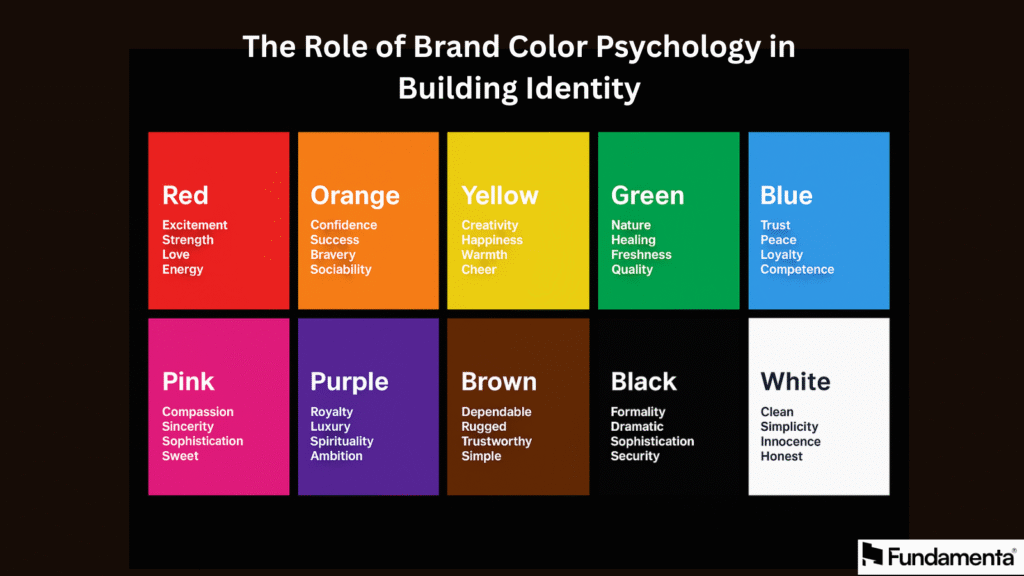
The Role of Brand Color Psychology in Building Identity
Brand color psychology ensures consistency across your branding logo, website, packaging, and marketing campaigns. When your colors are aligned with your brand personality, customers not only recognize you faster but also form emotional bonds with your products.
Your tone of voice should reflect the difference between brand strategy and marketing strategy, creating alignment across all communications.
Color Psychology Chart: Meanings & Associations
Here’s a simplified chart to guide you:
| Color | Meaning | Brand Associations |
|---|---|---|
| Red | Energy, urgency, passion | Coca-Cola, YouTube |
| Blue | Trust, stability, calm | Facebook, LinkedIn |
| Yellow | Optimism, clarity, cheer | McDonald’s, Ikea |
| Green | Nature, growth, health | Starbucks, Spotify |
| Black | Power, luxury, modernity | Nike, Chanel |
| Purple | Creativity, royalty, imagination | Cadbury, Twitch |
At Funda Menta, we help brands use this branding color psychology framework to align design with strategy.
Did you know? Circular logos are often linked with community, friendship, and unity, while angular logos (triangles, squares) are seen as strong, stable, and trustworthy
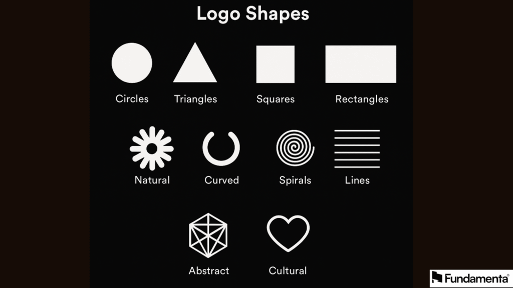
Shape Psychology in Logos

How Shapes Communicate Brand Personality
Shapes are the silent language of design. They subconsciously tell your audience what to feel about your brand. While colors trigger emotions, shapes communicate personality.
If your current tone feels inconsistent, it may be one of the signs you need rebranding to refresh your brand messaging.
Circles, Squares, and Triangles: What They Symbolize
- Circles → Unity, harmony, community (think Target or BMW).
- Squares/Rectangles → Stability, trust, reliability (Microsoft, BBC).
- Triangles → Power, motion, direction (Adidas, Delta Airlines).
Abstract and Complex Shapes in Modern Branding
Many modern brands experiment with abstract or complex logos to appear innovative and future-forward. For instance, Airbnb’s symbol combines curves and geometry to evoke belonging and modernity. Abstract logos often appeal to younger, design-savvy audiences.
Did you know? Serif fonts in logos (like Times New Roman) give a traditional and authoritative feel, whereas sans-serif fonts (like Helvetica) convey modernity and simplicity.
Font Psychology in Logos
How Typography Shapes Brand Perception
Fonts matter as much as colors. A playful script font tells a different story than a bold sans-serif. This is font psychology the way typography communicates tone, trust, and brand values.
Serif vs. Sans-Serif: Which Works Best?
- Serif fonts (e.g., Times New Roman) suggest tradition, heritage, authority. Luxury brands like Vogue often use serif.
- Sans-serif fonts (e.g., Helvetica) signal modernity, simplicity, clarity. Tech brands like Google and Spotify rely on them for clean communication.
The Role of Custom Fonts in Branding Psychology
Custom fonts give brands uniqueness. Think of Coca-Cola’s handwritten script or Disney’s playful typography. At Funda Menta, we often advise companies to explore custom typography if they want stronger distinctiveness and trademark protection.
Overall Logo Design Psychology
How Colors, Shapes, and Fonts Work Together
The true magic of logo psychology happens when colors, shapes, and fonts are aligned. For example:
- A tech startup may choose blue + geometric sans-serif for trust and innovation.
- A wellness brand might prefer green + rounded shapes to evoke growth and calm.
Balancing Aesthetics and Consumer Perception
Logos should look appealing, but more importantly, they should feel right to your target market. That’s where psychology ensures that design isn’t just beautiful but also strategic.
Avoiding Common Mistakes in Logo Psychology
- Choosing trendy colors/fonts without strategy.
- Ignoring cultural differences in color meanings.
- Overcomplicating the logo with too many elements.
Logo Psychology in Action
Real-World Examples of Effective Logo Design
- Apple → Minimalist shape + silver/black tones = innovation + luxury.
- Nike → The swoosh = motion, ambition, achievement.
- McDonald’s → Yellow + arches = happiness, family, fast service.
Case Studies: How Brands Use Logo Psychology for Impact
- Starbucks shifted from brown to green to emphasize community and sustainability.
- Google uses a playful, multi-color scheme to signal creativity and diversity.
- FedEx cleverly hides an arrow between “E” and “x” to symbolize speed and direction.
Lessons for Building Your Own Brand Logo
- Choose colors based on emotion, not personal preference.
- Pick shapes that align with your brand voice.
- Select fonts that speak the same language as your audience.
- Always test your logo in real-world settings (web, packaging, print).
Conclusion
At Funda Menta, we believe that branding color psychology, shape symbolism, and font psychology must work hand in hand. By applying the principles of logo psychology, your business can create a design that not only looks good but also works hard reinforcing your values, increasing recognition, and driving customer loyalty.
A misaligned tone of voice can impact engagement and may explain why your B2B website isn’t converting effectively.
In a competitive market, the right logo isn’t just art it’s strategy backed by psychology.
Frequently Asked question
1. What is logo psychology and why does it matter in branding?
Logo psychology is the study of how design elements such as colors, shapes, and fonts influence consumer perception and emotions. It matters because people often form brand impressions within seconds, and a well-designed logo can instantly build trust, recognition, and emotional connection. Without understanding logo psychology, businesses risk creating visuals that confuse or fail to resonate with their target audience.
2. How does color psychology in logo design influence customer perception?
Color psychology in logo design explains how different colors trigger specific emotions and associations in people. For example, blue conveys trust and professionalism, while red sparks energy and urgency. Using the right branding color psychology helps businesses communicate their values and stand out in crowded markets. Misusing colors, however, can lead to mixed signals and weaken your overall brand identity.
3. What role do shapes play in logo psychology?
Shapes are silent yet powerful cues in logo design. Circles symbolize unity and community, squares suggest stability and reliability, while triangles often communicate power and direction. Abstract shapes give a sense of innovation and modernity. By applying logo psychology to shapes, businesses can reinforce their brand personality and create logos that visually align with their strategic positioning.
4. Why is typography important in logo design psychology?
Typography shapes the tone and perception of a brand just as much as colors and shapes. Serif fonts often represent tradition and authority, while sans-serif fonts convey simplicity and modernity. Custom fonts can add uniqueness and memorability. In logo psychology, choosing the right font ensures that the message you want to send is clearly communicated and consistent with your overall brand voice.
5. Can applying logo psychology improve brand recognition and loyalty?
Yes, applying logo psychology can significantly boost brand recognition and customer loyalty. When colors, shapes, and fonts are strategically aligned with your brand’s values, customers recognize your logo faster and build emotional associations with it. Over time, this psychological connection makes people more likely to trust your brand, recommend it, and remain loyal, turning your logo into a long-term business asset.


